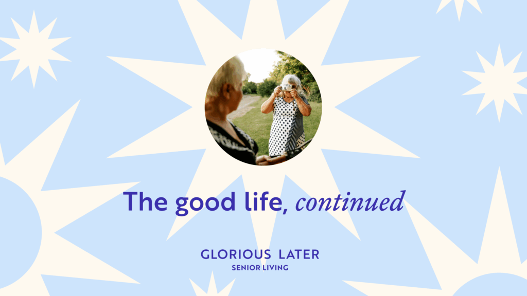
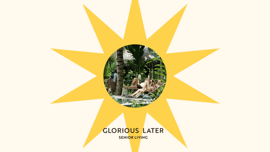
Glorious Later Senior Living
Brand Guide
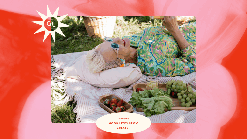
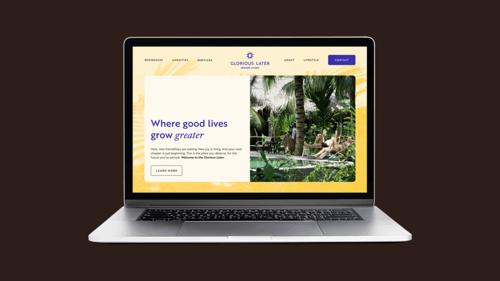
Where Good Lives Grow Greater
There are plenty of places made for slowing down. This isn’t one of them. This is where life keeps its pace, new energy evolves, and the good life only grows greater. Because we believe life doesn’t shrink with age. It expands—opening up to more warmth, wisdom, and wonder. Here, new friendships are waiting. New joy is rising. And your next chapter is just beginning. This is the place you deserve, for the future you’ve earned. Welcome to the Glorious Later.
Our Archetype
The Innocent
Overview
Motto
“Free to be you and me”
Gift
Faith, Optimism, Simplicity.
Motivation
To experience paradise, to live a happy, harmonious life
Goal
To be happy and create a joyful, safe environment
Strategy
Doing things right, simplify the complex
Challenge
Being boring
Characteristics
Traits
- Optimistic
- Simple
- Honest
- Transparent
- Welcoming
Make Consumers Feel
- Hopeful
- Joy
- Encouraged
- “I can be at peace”
- Safe
Values
Choose Joy
We believe happiness is a choice we make every day. From warm smiles to new adventures, we create a place where joy is always within reach.
Essence: Joyful, optimistic living
Embrace Wonder
Life doesn’t stop surprising us — and we keep welcoming it with open arms. New experiences, friendships, and discoveries await at every turn.
Essence: Curiosity, excitement about life
Honor the Journey
Every resident brings a lifetime of stories, lessons, and dreams. We celebrate every chapter, treating age not as a decline, but as a rich and beautiful adventure.
Essence: Respect for life’s experiences
What we sound like
Our Messaging
How We Communicate
Warm
Always sound friendly, approachable, and kind.
Example: "Welcome Home"
Joyful
Infuse communications with lightness, optimism, and celebration of life.
Example: "There's always something new to smile about"
Inviting
Emphasize inclusion, belonging, and openness to discovery.
Example: "Join a community that feels like family – and adventure"
Gracious
Respect the dignity of aging, avoiding any condescension.
Example: "Welcome to your next great chapter"
Fresh & Uplifting
Position every interaction as a positive, exciting step forward.
Example: "New friends. New memories. A new kind of senior living.”
Natural
Reflect the importance of the environment and peaceful surroundings.
Example: "Where lush gardens and open skies welcome you daily"
Headlines
-
The place you deserve. The future you earned.
-
The future feels good here.
-
Where life’s best is yet to come
-
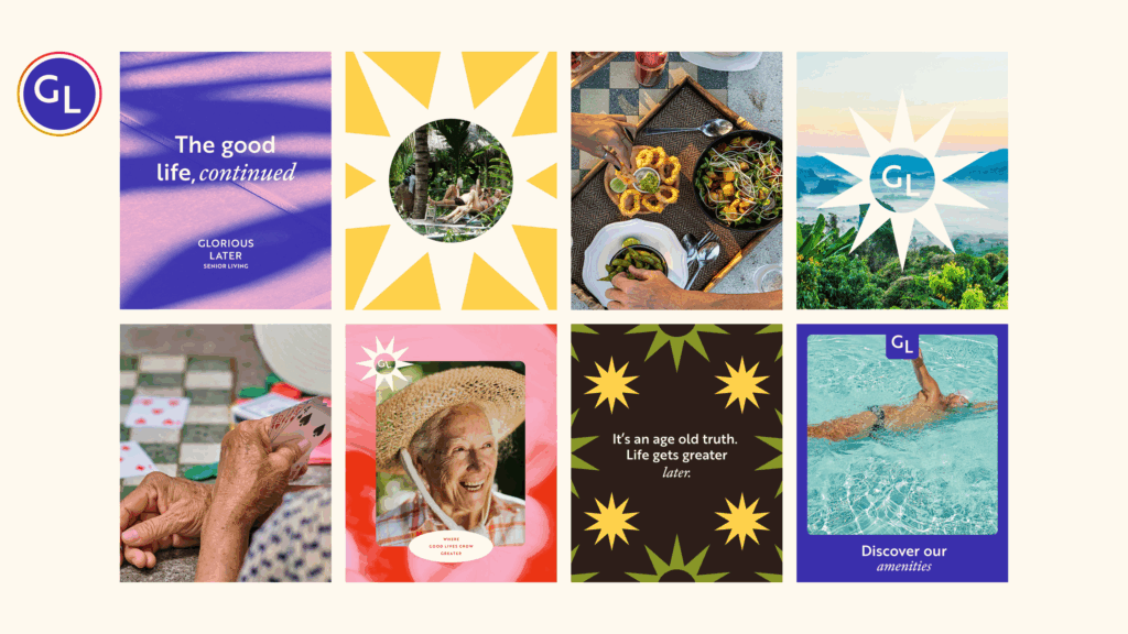
It’s an age old truth. Life gets greater later.
-
The good life, continued.
-
The good life only gets better from here.
-
Where good lives grow greater
-
A community thriving in peace and possibility
The core of our brand
Our Logo Suite
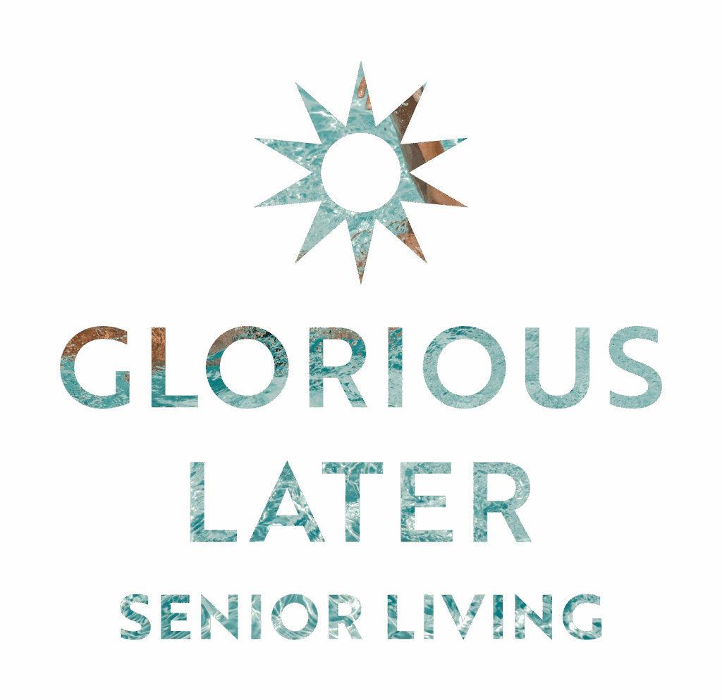
Combo Mark
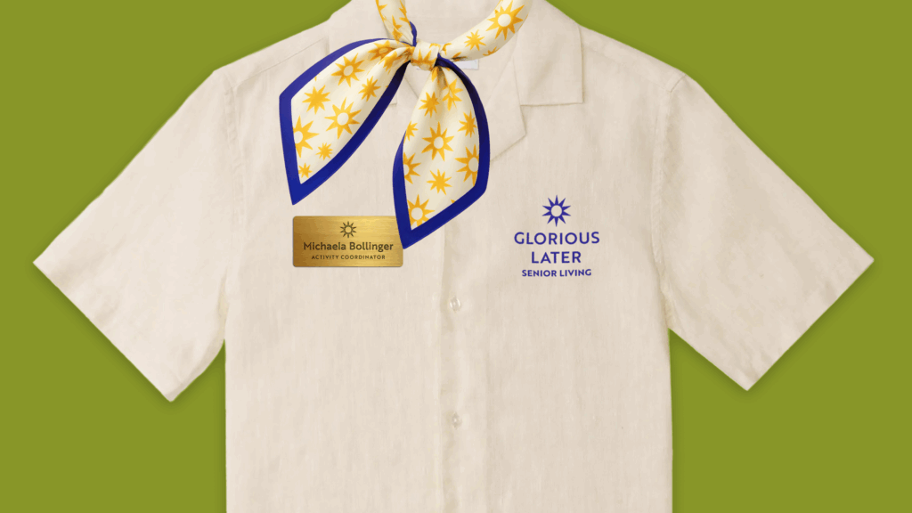
Our logo features a geometric sans serif typeface and simple geometric sunburst to comunicate our modern and straightforward approach to senior living. Senior living should be full of light and life, and our sunburst is representative of that.
The full Combo Mark should be on all official collateral when space allows. Use the vertical and horizontal variations as needed. Only set it in the following approved colorways primarily showcasing the mark in our primary colors: Bold Blue, Sunshine Yellow, and Comfort Cream. The Black and White colorways are only to be used on brand partnership collateral when required by brand partners. GL (Glorious Living) brand colorways are to be used on all GL branded items.
Combo Vertical Blue Bold
Combo Vertical Yellow
Combo Vertical Cream
Combo Vertical Brown
Combo Vertical Blue Breezy
Combo Vertical Red
Combo Vertical Pink
Combo Vertical Green
Combo Vertical White
Combo Vertical Black
Combo Horizontal Blue Bold
Combo Horizontal Yellow
Combo Horizontal Cream
Combo Horizontal Brown
Combo Horizontal Blue Breezy
Combo Horizontal Red
Combo Horizontal Pink
Combo Horizontal Green
Combo Horizontal White
Combo Horizontal Black
Word Mark
Our Word Mark is the same as the Combo Mark sans Logo Mark. It is to be used on all official collateral when the space does not allow for the full Combo Mark.
Use the vertical and horizontal variations as needed. Only set it in the following approved colorways primarily showcasing the mark in our primary colors: Bold Blue, Sunshine Yellow, and Comfort Cream. The Black and White colorways are only to be used on brand partnership collateral when required by brand partners. GL (Glorious Living) brand colorways are to be used on all GL branded items.
Word Mark Vertical Blue Bold
Word Mark Vertical Yellow
Word Mark Vertical Cream
Word Mark Vertical Brown
Word Mark Vertical Blue Breezy
Word Mark Vertical Red
Word Mark Vertical Pink
Word Mark Vertical Green
Word Mark Vertical White
Word Mark Vertical Black
Word Mark Horizontal Blue Bold
Word Mark Horizontal Yellow
Word Mark Horizontal Cream
Word Mark Horizontal Brown
Word Mark Horizontal Blue Breezy
Word Mark Horizontal Red
Word Mark Horizontal Pink
Word Mark Horizontal Green
Word Mark Horizontal White
Word Mark Horizontal Black
Sun & GL Icon
Our Sun & GL Icon is our primary icon composed of our sunburst Logo Mark and monogram made up of the Word Mark letterforms.
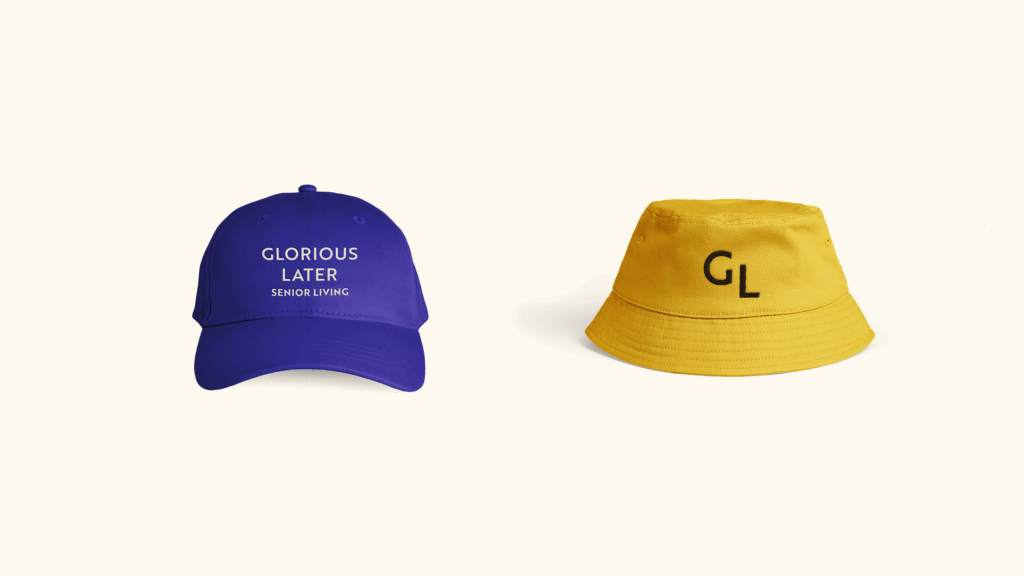
Use in brand applications with limited size allotments such as favicons and in embroidery as well as as a design element on applications such as social media posts and merchandise. Only set it in the following approved colorways primarily showcasing the mark in our primary colors: Bold Blue, Sunshine Yellow, and Comfort Cream.
Icon Sun GL Blue Bold
Icon Sun GL Yellow
Icon Sun GL Cream
Icon Sun GL Brown
Icon Sun GL Blue Breezy
Icon Sun GL Red
Icon Sun GL Pink
Icon Sun GL Green
GL Icon
The simplest form of the brand, the GL Icon may be used as a brand signifier when space is severely limited, or as a design element on applications such as social media posts and merchandise.
Only set it in the following approved colorways primarily showcasing the mark in our primary colors: Bold Blue, Sunshine Yellow, and Comfort Cream.
Icon GL Blue Bold
Icon GL Yellow
Icon GL Cream
Icon GL Brown
Icon GL Blue Breezy
Icon GL Red
Icon GL Pink
Icon GL Green
Logo Mark
Our Logo Mark is the symbol included in the Combo Mark.
Use the Sun & GL Icon as the primary Icon and utilize this mark as a design element on applications such as social media posts and merchandise. Only set it in the following approved colorways primarily showcasing the mark in our primary colors: Bold Blue, Sunshine Yellow, and Comfort Cream.
Logo Mark Blue Bold
Logo Mark Yellow
Logo Mark Cream
Logo Mark Brown
Logo Mark Blue Breezy
Logo Mark Red
Logo Mark Pink
Logo Mark Green
Sun Icon
Use the Sun & GL Icon as the primary Icon and utilize this mark as a design element on applications such as social media posts and merchandise. Only set it in the following approved colorways primarily showcasing the mark in our primary colors: Bold Blue, Sunshine Yellow, and Comfort Cream.
Icon Sun Blue Bold
Icon Sun Yellow
Icon Sun Cream
Icon Sun Brown
Icon Sun Blue Breezy
Icon Sun Red
Icon Sun Pink
Icon Sun Green
our logo
Usage
Safe Space
When displaying any of the logo variations, maintain ample space around it to avoid crowding or interference from other elements. To achieve this, don’t place anything within the “safe space” equivalent to 10% the width of the logo.
*Of course, there are exceptions: subtle patterns or textures overlapping at 20% opacity or less are acceptable.
Please Don't
Use unapproved color combinations or colors
Distort the logo and elements
Mask images into the logo
Place on backgrounds that make elements hard to read
Use alt fonts
Glorious Later in
Color
Primary Colors
Bold Blue
- Hex #3A2FAC
- RGB 58, 47, 172
- CMYK 66, 72, 0, 33
- Pantone 2369 C
Sunshine Yellow
- Hex #FFD24B
- RGB 255, 210, 75
- CMYK 0, 18, 71, 0
- Pantone 121 C
Comfort Cream
- Hex #FFFAEF
- RGB 255, 250, 239
- CMYK 0, 2, 6, 0
- Pantone 7499 C @ 24%
Secondary Colors
Our Secondary Colors are primarily used for background colors and to highlight key information such as subheaders.
*The only exception is Carefree Cocoa, which may be used as needed as a copy color to ensure optimum contrast.
Carefree Cocoa
- Hex #2D1E19
- RGB 45, 30, 25
- CMYK 0, 33, 44, 82
- Pantone 412 C
Radiant Red
- Hex #EB3414
- RGB 235, 52, 20
- CMYK 0, 78, 91, 8
- Pantone 2028 C
Glorious Green
- Hex #899728
- RGB 137, 151, 40
- CMYK 9, 0, 74, 41
- Pantone 2305 C
Breezy Blue
- Hex #CDE4FD
- RGB 205, 228, 253
- CMYK 19, 10, 0, 1
- Pantone 2127 C
Peaceful Pink
- Hex #F8B7D1
- RGB 248, 183, 209
- CMYK 0, 26, 16, 3
- Pantone 1905 C
Typography
Our Font Families
Eyebrow/Subheadings - Brother 1816 Bold, All Caps
ABCDEFGHIJKLMNOPQRSTUVWXYZ1234567890!@#$%^&
Headings - Brother 1816 Medium
Aa Bb Cc Dd Ee Ff Gg Hh Ii Jj Kk Ll Mm Nn Oo Pp Qq Rr Ss Tt Uu Vv Ww Xx Yy Zz
1234567890!@#$%^&
Accent - Adobe Kis Caption Italic
Aa Bb Cc Dd Ee Ff Gg Hh Ii Jj Kk Ll Mm Nn Oo Pp Qq Rr Ss Tt Uu Vv Ww Xx Yy Zz
1234567890!@#$%^&
Body - Brother 1816 Regular
Aa Bb Cc Dd Ee Ff Gg Hh Ii Jj Kk Ll Mm Nn Oo Pp
Qq Rr Ss Tt Uu Vv Ww Xx Yy Zz 1234567890!@#$%^&
depth through
Design Elements
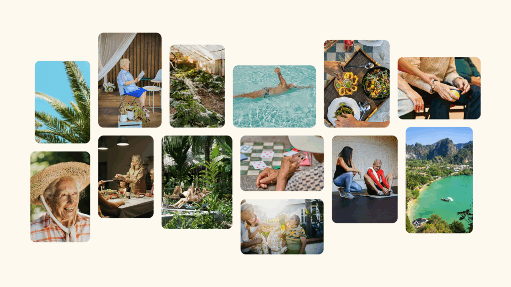
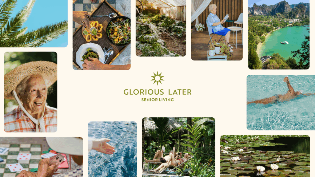
Photo Styling
Our photography features a bright array of seniors continuing to live their best lives. Whether they're enjoying the scenic Thai landscape, Glorious Later amenities, spending time with their families, or receiving care, Glorious Later Residents thrive.
Primarily showcase residents and their community through wide-angle and close-up shots to give a romantic impression of life lived at Glorious Later. Mix in landscape shots to give a snapshot of the bigger picture of life outside the facility.
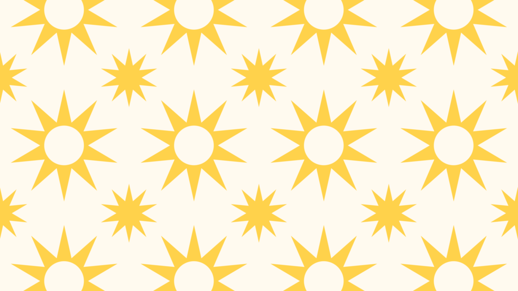
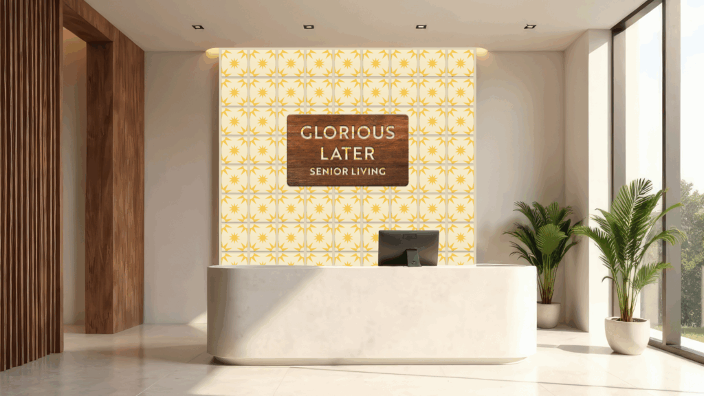
Sun Pattern
Our sun pattern features our Logo Mark and Sun Icon in a uniform yet playful arrangement. A few colorways have been provided, but feel free to mix and match the colors to keep it feeling fresh.
Use the Sun Pattern to add texture to brand applications such as stationery and social media graphic backgrounds.
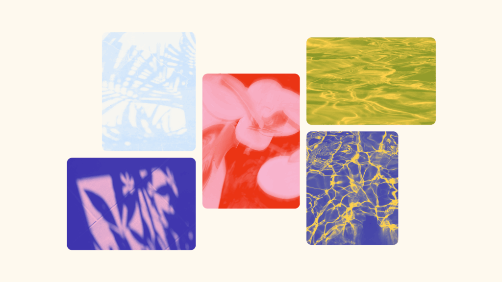
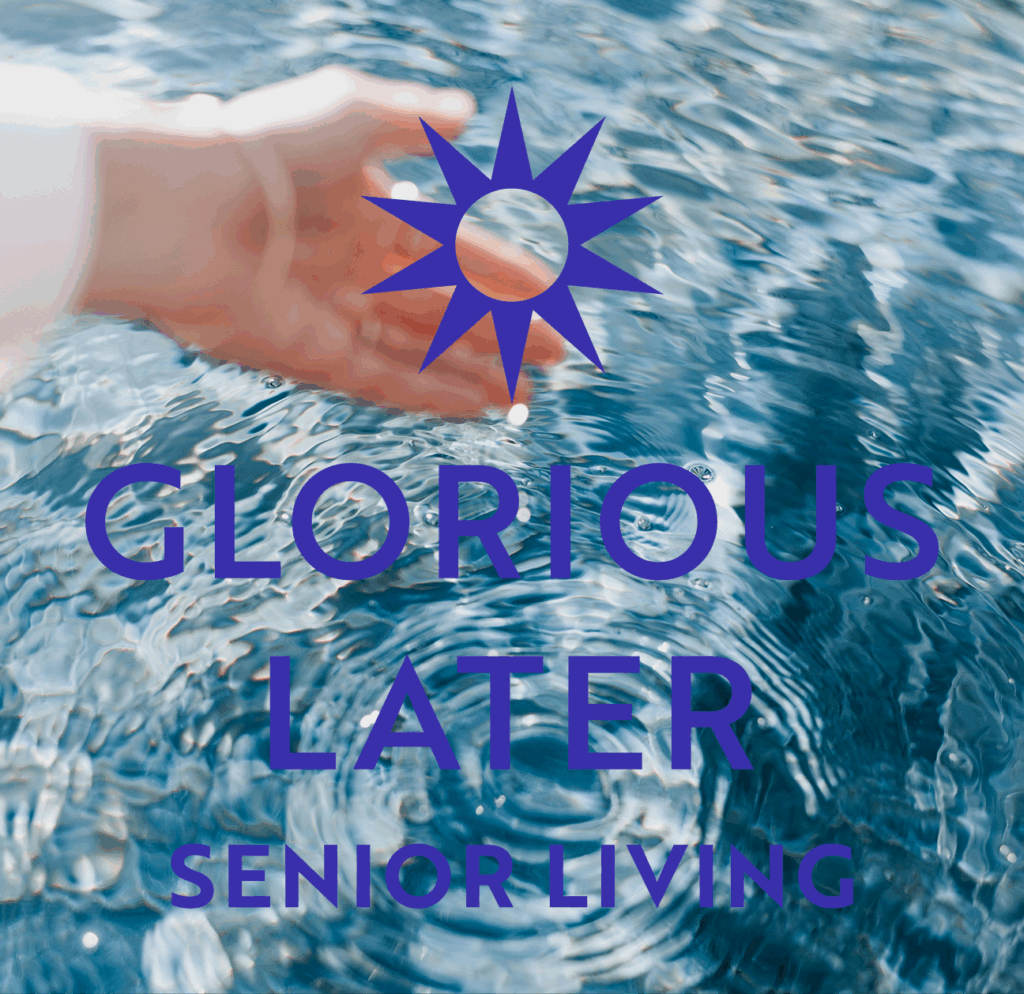
Nature Texture
Our Nature Textures serve to contrast the sharpness of the sunburst with a serene and calming backdrop.
Utilize the textures to add depth to backgrounds of brand applications such as web and social media graphics.
Brand in action
Application